
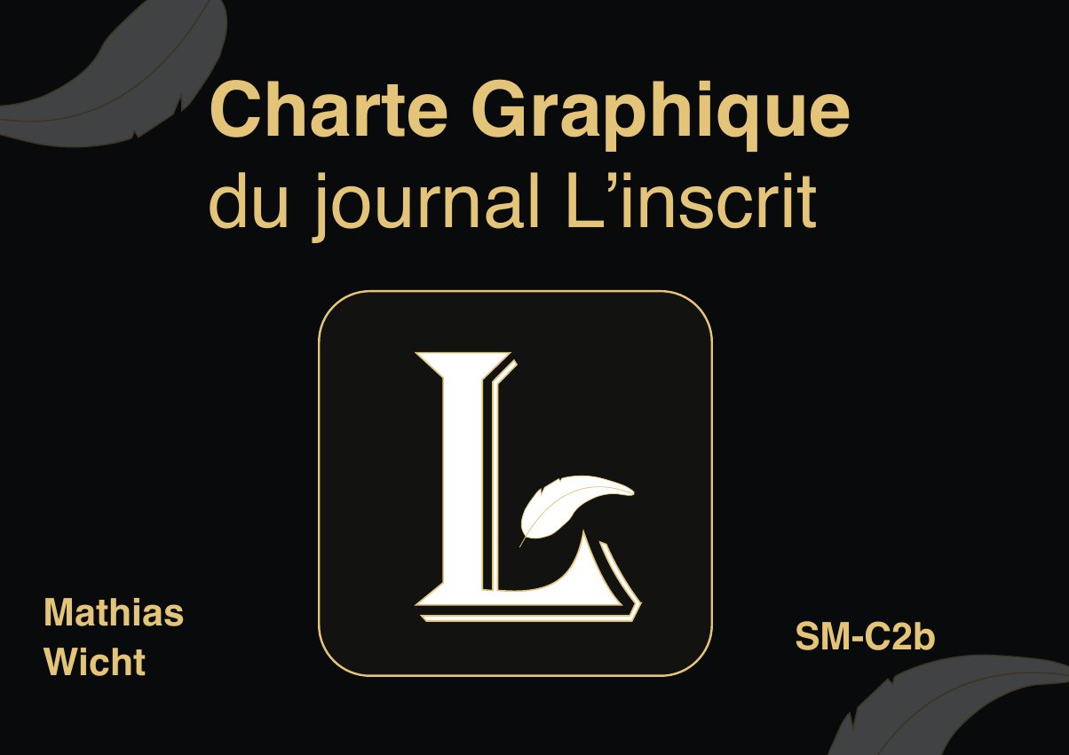
LogoThe idea behind the logo
For L'inscrit, I drew an L inspired by the drop caps of old newspapers, to clearly evoke the press. A quill completes the L and adds a touch of authenticity and tradition.
Black#000000
Gold#E8C989
White#FFFFFF
L'INSCRITAlgerian · Logo
Aa Bb CcHelvetica · Body text
RulesWhat the guidelines cover
- Main logo and variants: monochrome, negative, positive
- Misuse: distortion, wrong colours
- Clear space around the logo
- Typefaces and how to use them
- Applications: business card, envelope, A4 letterhead and flyer